Landing Page Design That Converts: A Practical 2026 Guide
A landing page exists to do one thing: move a specific visitor to a specific action, book a call, start a trial, buy, or subscribe. Every element either helps that action or gets in its way. The pages that convert are not the prettiest; they are the clearest. They make the offer obvious, the value believable, and the next step impossible to miss.
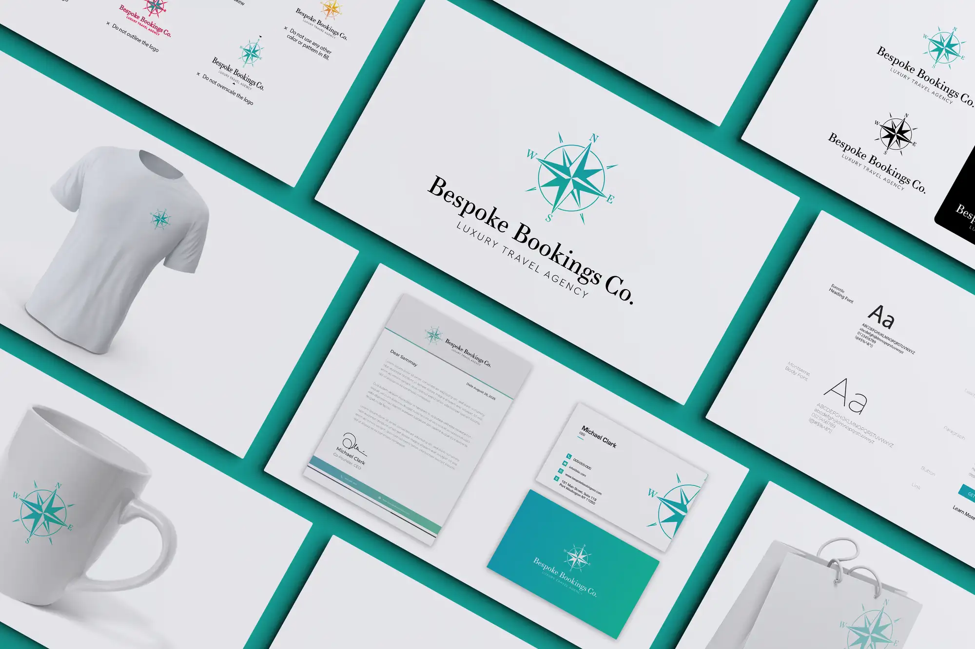
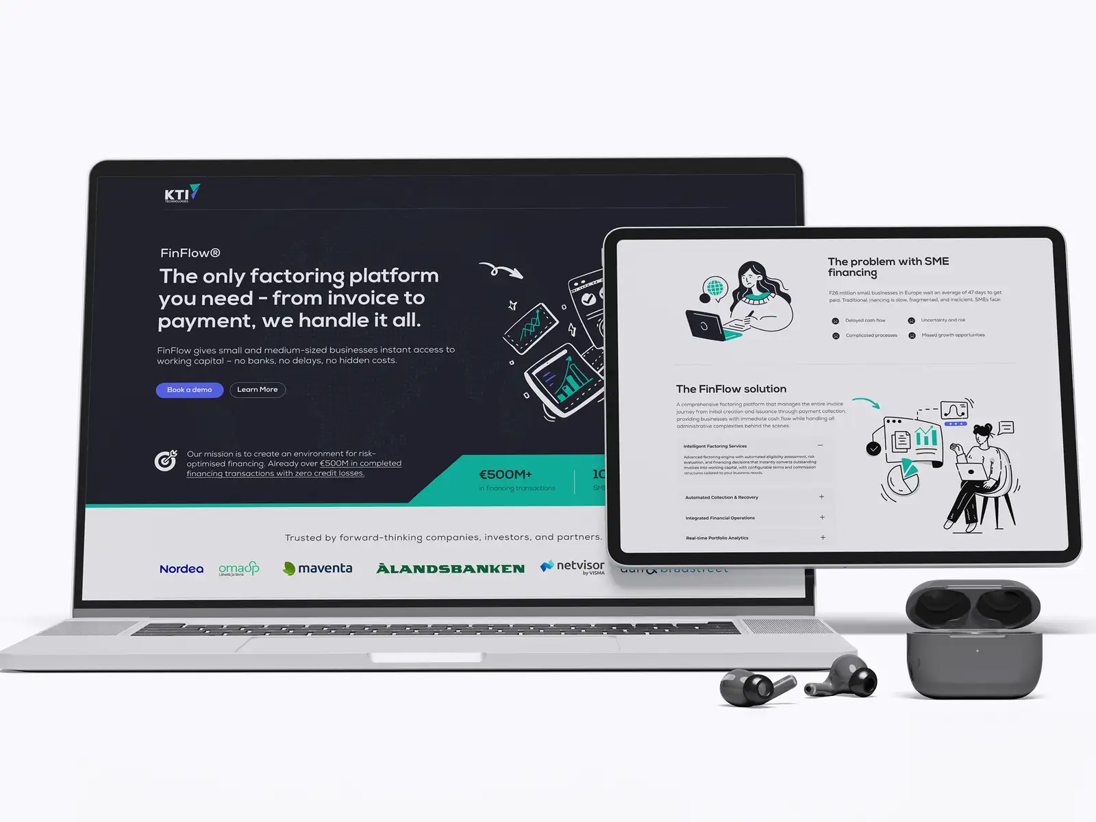
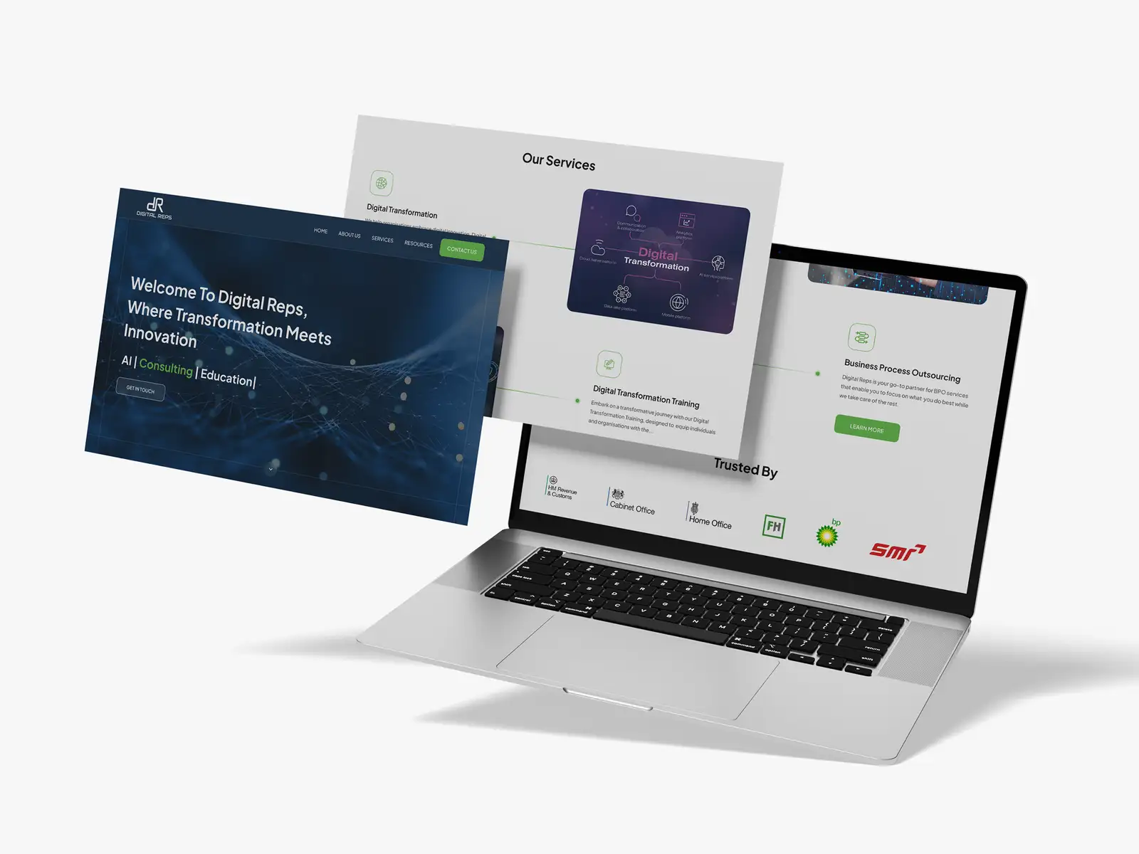
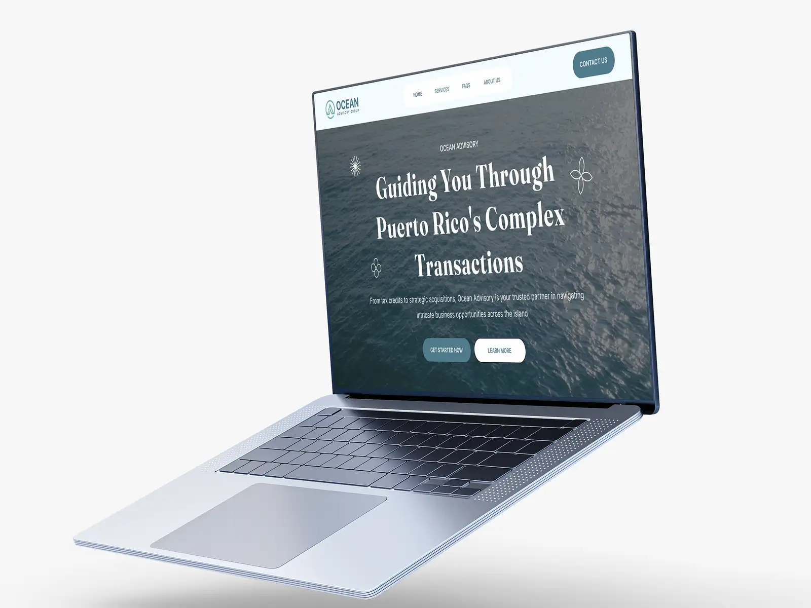
This is the framework we use when we design landing pages and UI/UX for clients, refined across 3,000+ projects as a Top Rated Plus agency on Upwork. If you are still deciding how structure and visuals divide up, start with UI vs. UX design.
The anatomy of a high-converting landing page
Strong pages tend to follow the same skeleton, top to bottom, because it mirrors how people decide:
- A clear headline: one specific promise that names the outcome, not a clever slogan.
- A supporting subhead: how you deliver that outcome, in one plain sentence.
- One primary call to action: a single, repeated button with action-led words.
- Proof: reviews, logos, results, or ratings that make the promise believable.
- Benefits over features: what the visitor gets, framed around their goal.
- Objection handling: a short FAQ or guarantee that removes the last hesitation.
Notice what is not on the list: a navigation bar full of exits, five competing offers, or a wall of text. A landing page is not a homepage. Every extra link is a door out of the room.
Above the fold: earn the scroll
The first screen decides whether anyone reads the rest. In the space a visitor sees without scrolling, they should grasp three things in seconds: what this is, who it is for, and what to do next. If your hero makes them think, you have already lost a share of the traffic you paid for.
Pair a benefit-led headline with a single prominent button and one piece of proof, a rating, a recognisable client, or a hard number. That trio answers "is this for me?" and "can I trust it?" before the visitor has to work for it.
Landing page vs. homepage: a quick contrast
| Landing page | Homepage | |
|---|---|---|
| Goal | One conversion action | Navigation & overview |
| Links | Minimal (often none in nav) | Full menu and footer |
| Audience | One segment, one offer | Everyone, every need |
| Message | Single focused promise | Broad value proposition |
| Success metric | Conversion rate | Engagement & routing |
Common mistakes that leak conversions
- A vague headline that names the product but not the outcome.
- Too many calls to action, so the visitor picks none.
- Leading with features and specs before establishing why anyone should care.
- No proof, or proof buried at the bottom where few people reach it.
- A long form asking for ten fields when three would do.
- Slow load and layout shift, the page that converts is also the page that appears quickly.
If a stranger cannot tell what you are offering and what to do next within five seconds of landing on a phone, the page is not ready, no matter how good it looks.
Design and speed are part of the offer
Polished, on-brand UI signals credibility before a word is read, and consistency with your wider brand identity makes the page feel like part of something established. But looks are not enough: a slow page quietly throws away conversions. Compress images, reserve space so nothing jumps, and keep the path light, the same Core Web Vitals targets in our technical SEO checklist apply here. Your build platform matters too; see WordPress vs. Webflow vs. Framer if you are choosing one.
Pre-launch landing page checklist
Run every page through this before it goes live:
- The headline names a specific outcome, not just the product.
- One primary call to action, repeated, with action-led wording.
- Proof is visible above the fold, not only at the bottom.
- Benefits lead; features support, and the form asks for the minimum.
- The page is readable and tappable on a real phone, not just the desktop canvas.
- Largest Contentful Paint under 2.5s and no visible layout shift on load.
- A short FAQ answers the top one or two objections.
Test, then refine
No one writes the highest-converting page on the first attempt. Ship a clear version, watch where people drop off, then test one change at a time, headline, hero proof, or button copy, rather than redesigning everything at once. Conversion is won in increments.
Want a landing page designed and built to convert, not just to look good? Explore our UI/UX design service, or see verified results on our Top Rated Plus profile on Upwork.
Frequently asked questions
What makes a landing page convert?
A clear, outcome-focused headline, a single repeated call to action, visible proof, benefits framed around the visitor's goal, and a fast, mobile-friendly page. Removing distractions like full navigation and competing offers also lifts conversions.
How is a landing page different from a homepage?
A homepage helps everyone navigate and understand your business broadly. A landing page targets one audience with one offer and one action, stripping out extra links and messages so the visitor stays focused on converting.
How many calls to action should a landing page have?
One primary action, repeated as the visitor scrolls. Multiple competing calls to action split attention and usually lower conversion. Keep the next step singular and obvious.
Does landing page speed affect conversions?
Yes. Slow loading and layout shift cause visitors to leave before they act, so the same Core Web Vitals targets that help SEO, such as an LCP under 2.5 seconds, also protect your conversion rate.
Want this done for you?
FRPROTECH is a Top Rated Plus Upwork agency with 3,000+ projects delivered across 30+ countries. Tell us your goals and we'll handle the rest.
Written by the FRPROTECH design team. 8+ years building brands and websites for clients in 30+ countries, with a 100% Job Success Score on Upwork.