Packaging Design That Sells: How to Win the Shelf and the Scroll
Packaging design sells when it does three jobs in order: it gets seen from a distance, it makes its one promise instantly clear, and it gives the buyer a reason to trust the product in their hand. Win those three and the design is working; miss any one and a great product dies on the shelf or scrolls past unbought. Packaging is the only piece of marketing that's present at the exact moment of purchase, which makes it the highest-leverage design you'll ever commission.
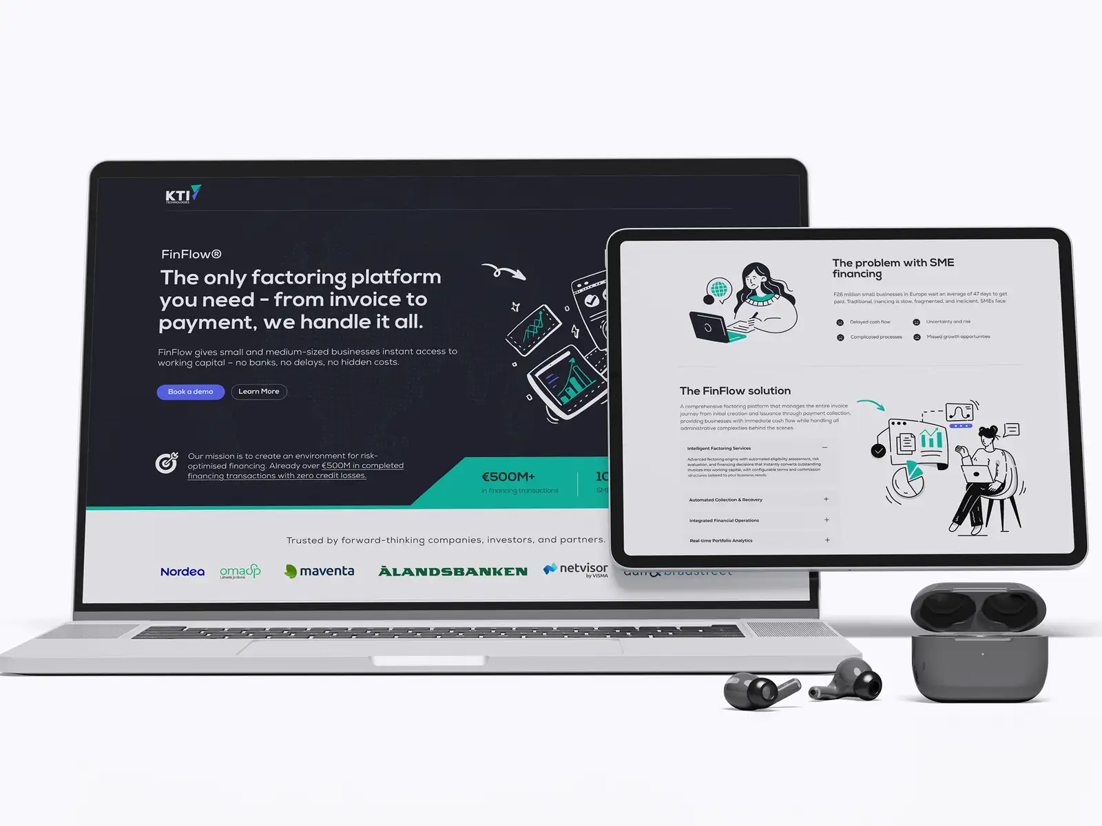
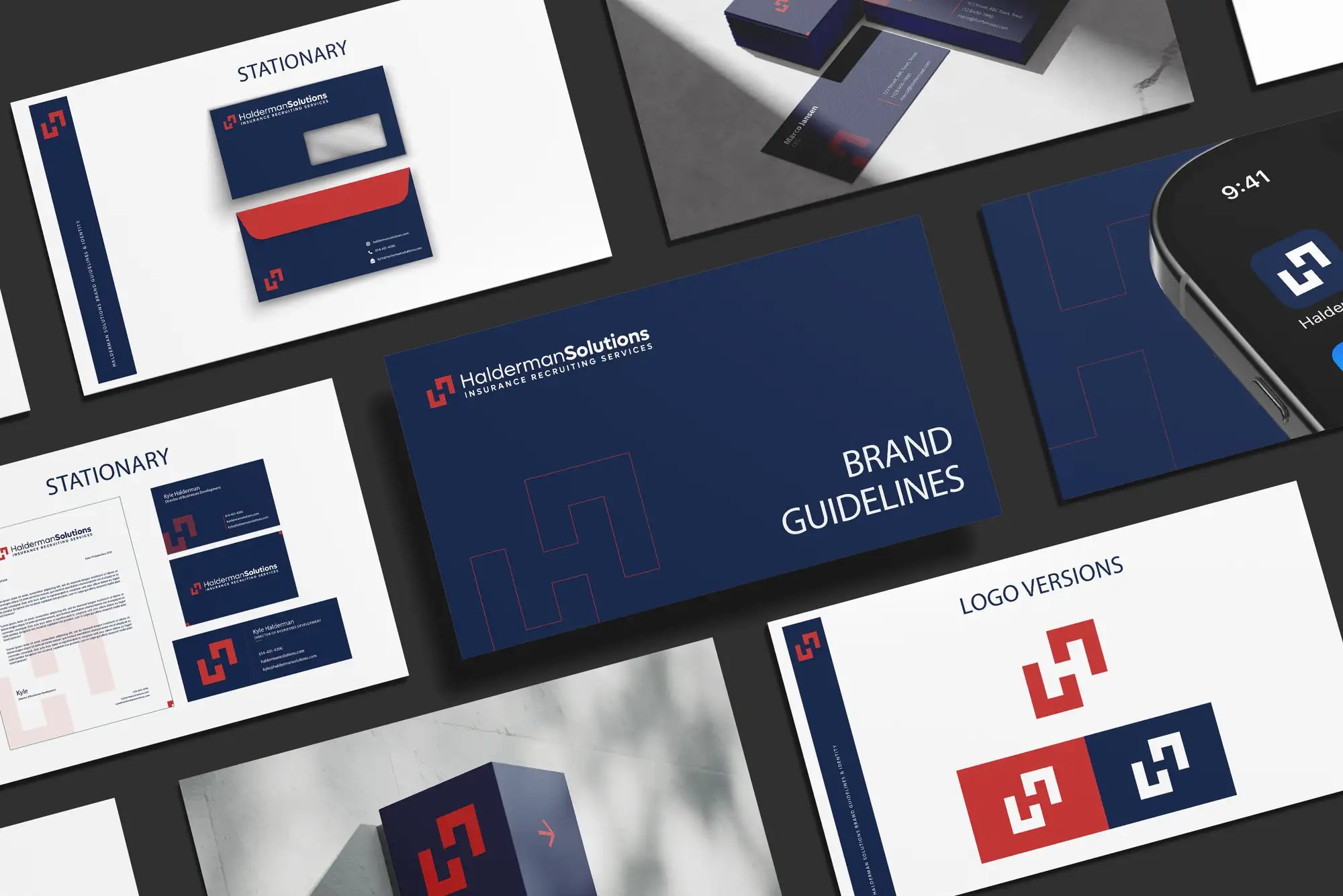
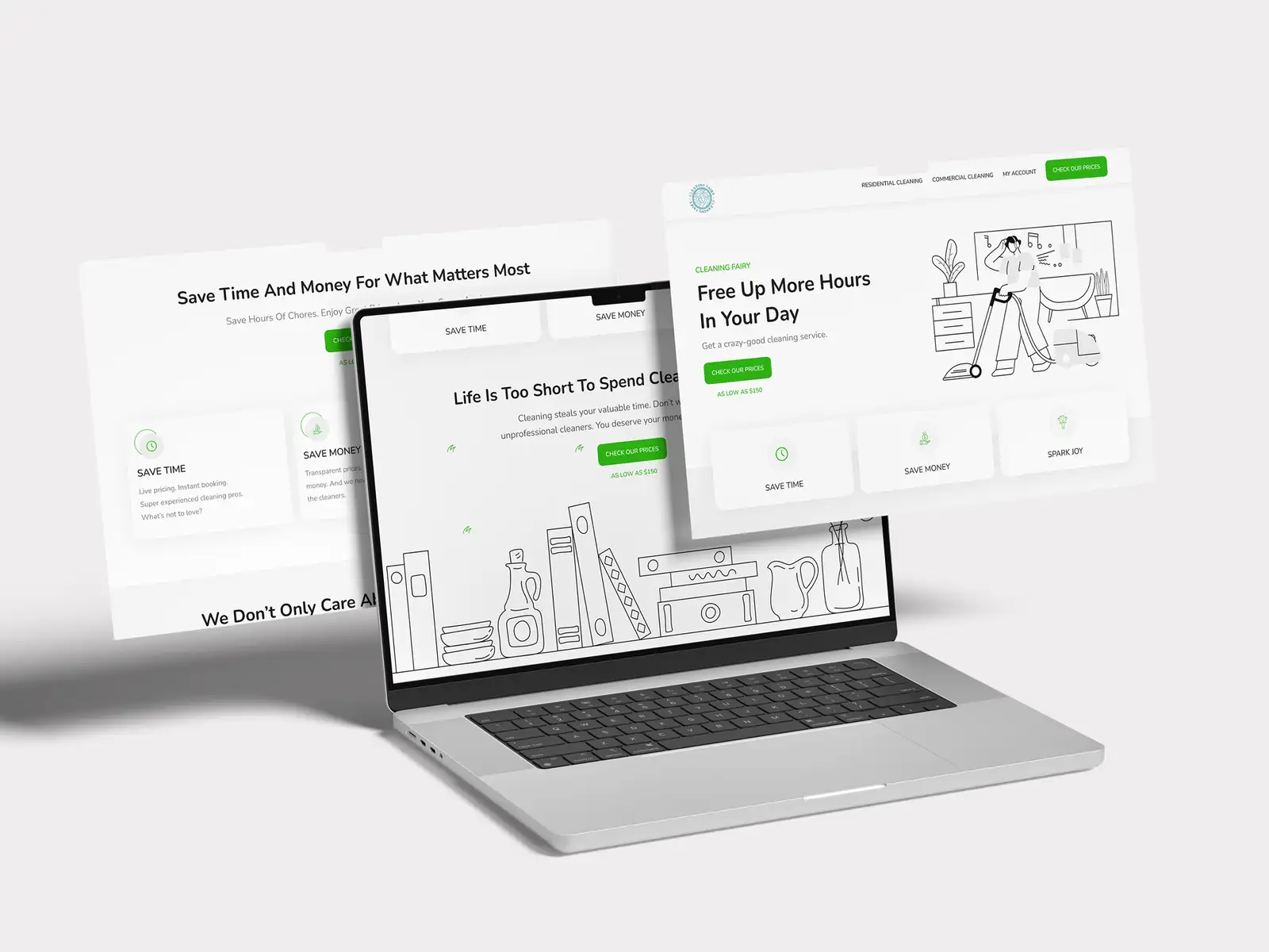
This guide covers what actually makes packaging sell, the mistakes that quietly cost the sale, what good packaging costs, and a checklist to brief a designer with confidence. It's the same approach we apply on graphic design and packaging projects across 8+ years and 3,000+ projects in 30+ countries as a Top Rated Plus agency on Upwork.
Packaging is your most-seen advert
Most brands pour money into ads that some people see once, then hand the actual point of sale to packaging they treated as an afterthought. That's backwards. On a shelf you're competing for attention in under a few seconds against dozens of rivals; on a marketplace listing or a social feed, your pack is a thumbnail fighting the same battle at the size of a postage stamp. The design has to survive both extremes.
Strong packaging also does work your ad creatives can't: it converts at the precise second the wallet is open, it travels home and keeps selling on the shelf and the bathroom counter, and it gets photographed and shared. A pack that looks premium raises the price a customer will happily pay, and it turns first-time buyers into repeat ones because they can find you again.
The shelf test: stand your design six feet back, or shrink it to thumbnail size, and look for two seconds. Can you tell what it is, who it's for, and why it's better? If not, no amount of beautiful detail will save it, because nobody gets close enough to see the detail.
The five jobs every pack has to do
Behind every pack that sells is the same short list of jobs, handled in the right order. Beauty matters, but only after these are solved.
- Stop the eye. A distinctive shape, colour block, or brand asset that stands out from the category and is recognisably yours, not a copy of the market leader.
- Say what it is. Instant product clarity, type of product, variant, and quantity, readable at a glance. Confusion is the fastest way to lose a sale.
- Make one promise. A single, dominant benefit or hook, not a wall of competing claims. One thing, said loudly.
- Build trust. The cues your buyer scans for, ingredients, certifications, origin, or proof, placed where they expect them.
- Guide the hand. Hierarchy that leads the eye from the hook to the detail to the call to buy, so the pack almost reads itself.
The anatomy of packaging that sells
Most of the result is decided by a few elements working together. Get these right and the pack does the selling for you.
A brand block that owns a colour and a shape
The fastest-selling packs own a visual territory, a colour, a silhouette, a recurring graphic device, that a regular buyer spots without reading a word. This is the same equity your brand identity system is built to create, applied to a physical object. If your pack looks like everyone else's in the aisle, you're paying to advertise the category, not your brand.
Ruthless hierarchy
There can only be one hero on the front. Decide what the buyer must read first, brand or benefit, make it dominant, and let everything else fall in behind it in clear tiers. Packs fail when five things all shout at once and the eye, given no path, simply moves on to a calmer competitor.
Type that survives the real world
Packaging type is read on a curved bottle, under shop lighting, at arm's length, and at thumbnail size online. That rules out hairline weights, tight tracking, and low-contrast colour pairings, the same legibility discipline good accessible design follows. If the variant name isn't readable at a glance, the buyer reaching for "unscented" grabs the wrong one and resents you for it.
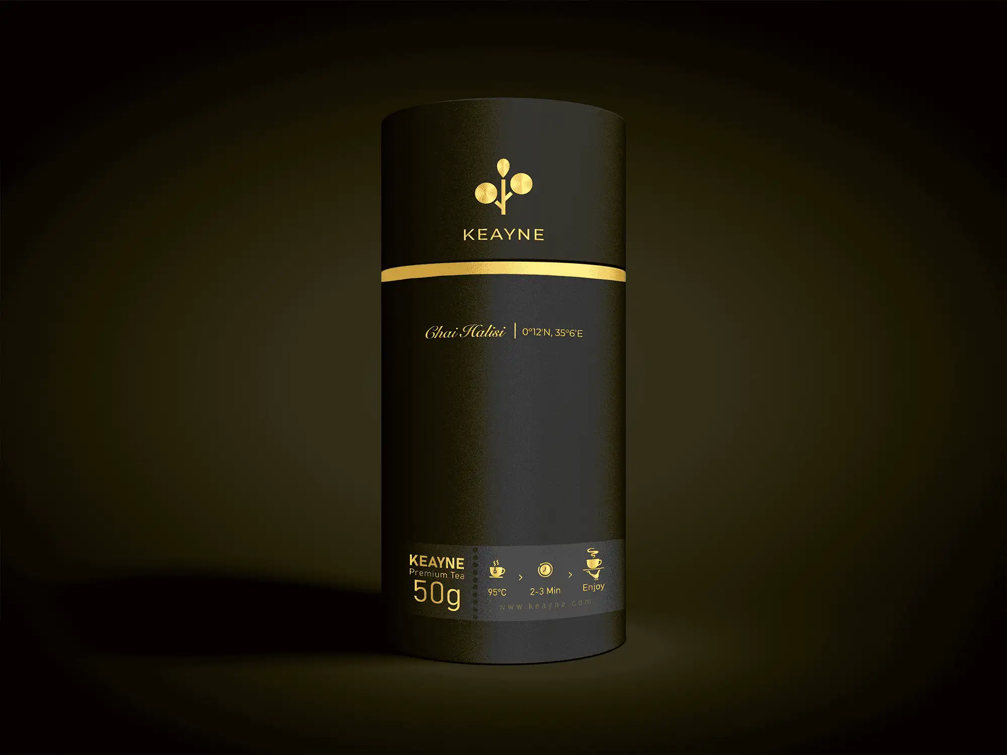
Finish and material as a message
Texture, weight, matte versus gloss, foil, and uncoated stock all signal price and values before a word is read. A soft-touch matte box reads premium; recycled kraft reads honest and natural. The material is part of the design, choose it on purpose, not just to hit the lowest unit cost.
Designing for the shelf and the scroll at once
In 2026 most products sell in two worlds, and a pack designed only for one loses in the other. The table below shows how the same design has to flex.
| Context | What wins | What fails |
|---|---|---|
| Physical shelf | Big brand block, bold colour, clear silhouette | Fine detail and tiny type nobody gets close to |
| Marketplace thumbnail | Reads at postage-stamp size, high contrast | Crowded fronts that turn to mush when shrunk |
| Social / unboxing | Photogenic finish, a moment of delight inside | Flat, generic packs nobody bothers to share |
| In the hand | Honest claims, easy-to-find detail, good feel | Overpromise on front, disappointment on back |
The practical rule: design the front to win at thumbnail size first. If it works as a tiny square on a phone, it will almost always work on the shelf too, and the same hierarchy that helps a landing page convert, one hero, one promise, one path, is exactly what carries here.
The packaging mistakes that quietly kill sales
Most failed packaging isn't ugly, it just makes one of these avoidable errors:
- Designing for the designer, not the shelf. A subtle, sophisticated pack that vanishes into the aisle loses to a louder, clearer rival every time.
- Too many messages. Five benefits, three badges, and a paragraph of copy on the front add up to nothing read at all.
- Copying the category leader. Looking like the market leader trains shoppers to reach past you for the original.
- Ignoring the thumbnail. A pack that's stunning in your hand but illegible online is half-built for how products actually sell now.
- Forgetting the dieline and print reality. Designs that ignore folds, seams, bleed, and curved surfaces look broken in production, however good the flat artwork was.
- No system for variants. When each flavour or scent is designed in isolation, the range looks like five different brands and loses its shelf presence.
What good packaging design costs
Packaging is priced by scope, one label versus a full range, and by how much strategy and print preparation it includes. Cheap, template-driven artwork costs little up front and far more in lost sales and reprints. Treat it the way you'd treat a logo versus a full brand identity: the deliverable that looks similar can hide a huge gap in the thinking behind it.
- Single label or pack, one SKU, supplied as print-ready artwork, the entry point for a first product.
- Product range, a system that keeps the line coherent while making each variant easy to tell apart at a glance.
- Full packaging identity, strategy, structure, brand block, and a scalable template kit your team or printer can extend.
Always budget for print-ready files, a correct dieline, bleed, accurate spot colours, and a printer proof. The most expensive packaging mistake isn't a design fee, it's a full production run that prints wrong because the artwork was never set up properly.
Your packaging design checklist
Run any pack, yours or a quote you've been sent, through this before it goes to print:
- It passes the two-second shelf test and the thumbnail test.
- There's one clear hero and a single dominant promise on the front.
- Product type, variant, and quantity read at a glance.
- It owns a distinctive colour or asset, and doesn't ape a competitor.
- Trust cues (ingredients, proof, certifications) sit where buyers look.
- The variant system keeps the range coherent and easy to distinguish.
- Artwork is set up for real production: dieline, bleed, spot colours, proof.
- It still looks premium, and honest, when the product is in the buyer's hand.
Packaging done well is the cheapest sales rep you'll ever hire: it shows up at every purchase, sells while you sleep, and makes the whole brand look more valuable. If you'd rather have it designed and production-ready from the start, our graphic design and packaging service builds packs that win the shelf and the scroll, and you can check verified results on our Top Rated Plus profile on Upwork.
Frequently asked questions
What makes packaging design sell more product?
Packaging sells when it does three things in order: it gets seen from a distance and at thumbnail size, it makes one clear promise about what the product is and why it's better, and it gives the buyer a reason to trust it, ingredients, proof, or certifications, where they expect to find them. A distinctive brand block, ruthless hierarchy with a single hero, and legible type do most of the work.
How much does professional packaging design cost?
It depends on scope. A single print-ready label or pack for one SKU sits at the entry level; a coherent system for a product range costs more; and a full packaging identity with strategy, structure, and a scalable template kit is the most involved. Always budget for proper print preparation, dieline, bleed, spot colours, and a printer proof, because a wrong production run costs far more than the design fee.
How do I design packaging that works both on the shelf and online?
Design the front to win at thumbnail size first: a big brand block, bold colour, high contrast, and one dominant message. If it reads clearly as a tiny square on a phone, it will almost always work on a physical shelf too. Keep fine detail off the primary message, and use a photogenic finish so the pack is worth sharing in social and unboxing content.
What are the most common packaging design mistakes?
The big ones are crowding the front with too many messages, designing something subtle that vanishes on the shelf, copying the category leader so shoppers reach past you, ignoring how the pack looks at thumbnail size online, and forgetting print reality, dielines, bleed, folds, and curved surfaces. Designing each variant in isolation, so the range looks like several different brands, is another frequent and costly error.
Want this done for you?
FRPROTECH is a Top Rated Plus Upwork agency with 3,000+ projects delivered across 30+ countries. Tell us your goals and we'll handle the rest.
Written by the FRPROTECH design team. 8+ years building brands and websites for clients in 30+ countries, with a 100% Job Success Score on Upwork.