How to Choose Fonts for Your Brand: A Typography Pairing Guide for 2026
To choose fonts for your brand, start with the feeling and the job, not the font menu: decide how you want to come across and where the type has to work, then pick one heading typeface with a strong personality, one body typeface that's effortless to read at small sizes, and make sure the two clearly contrast without clashing. Keep your whole brand to two typefaces (three at the absolute most), check that both render well on screen, in print, and on a phone, and lock the exact fonts and sizes in your brand guidelines so every designer, developer, and document uses the same set. Type is the half of your identity people rarely notice but always feel, so the goal is a pairing that's legible, distinctive, and unmistakably yours, not just a font that looks nice in a header.
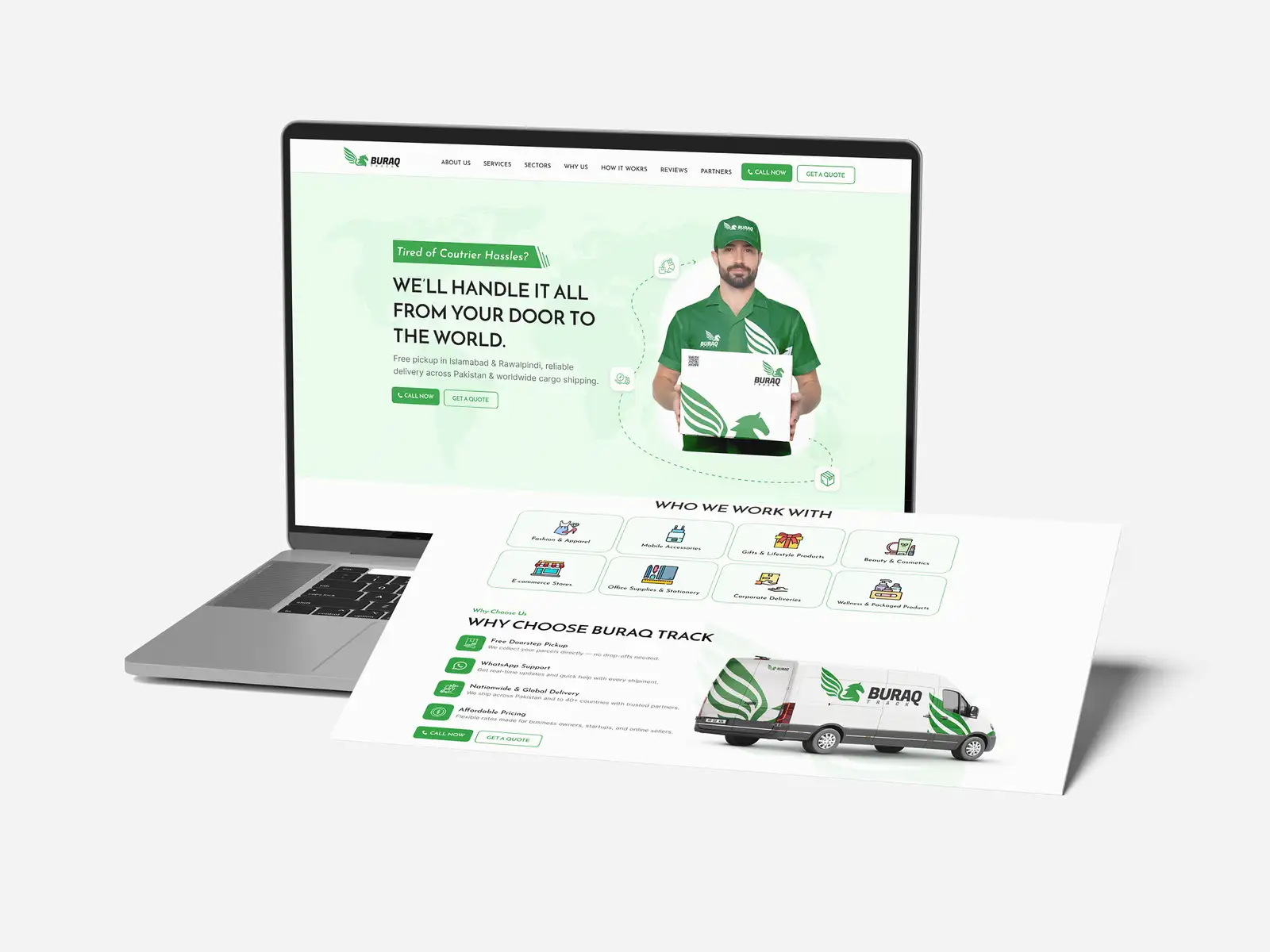
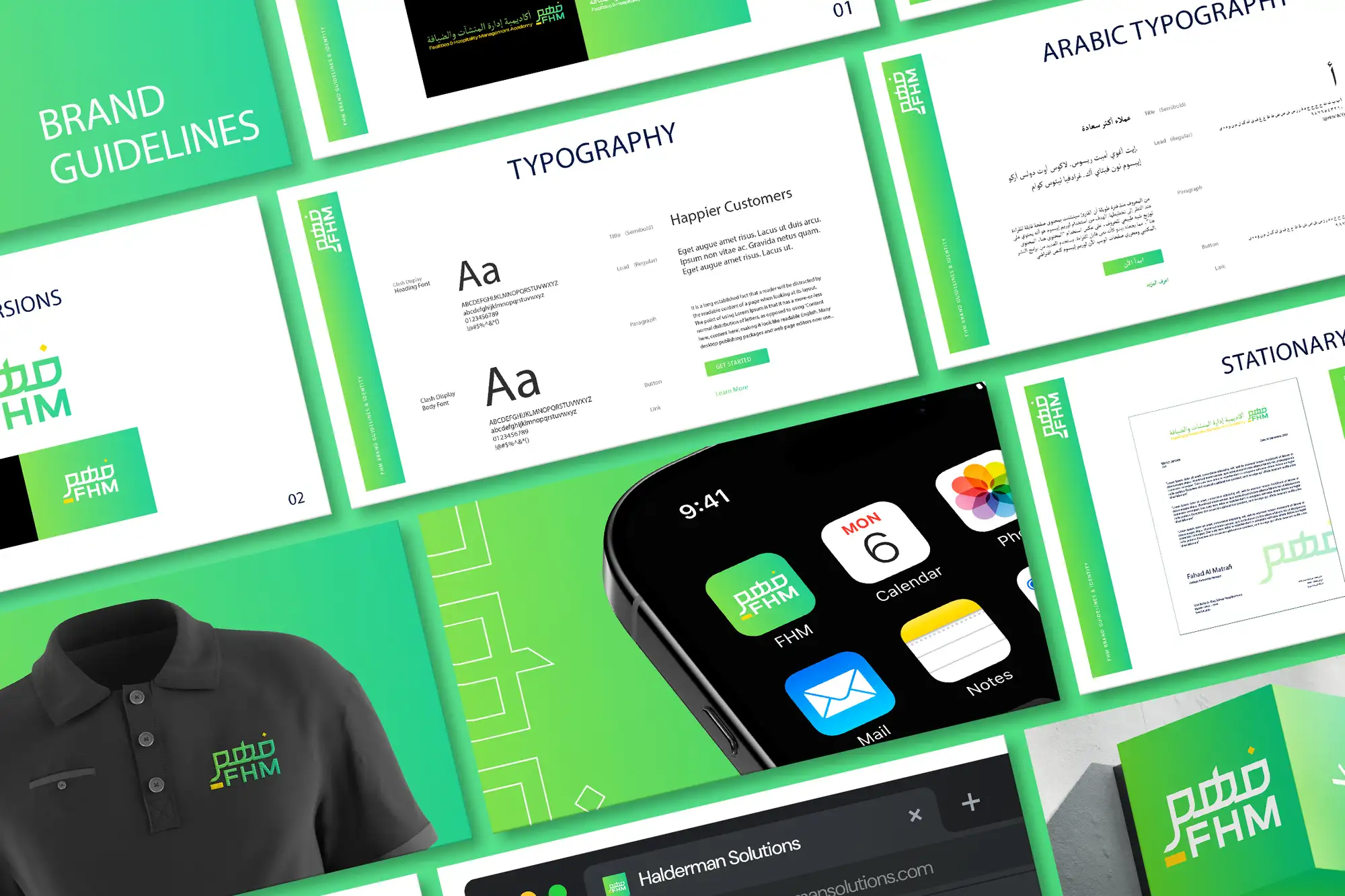
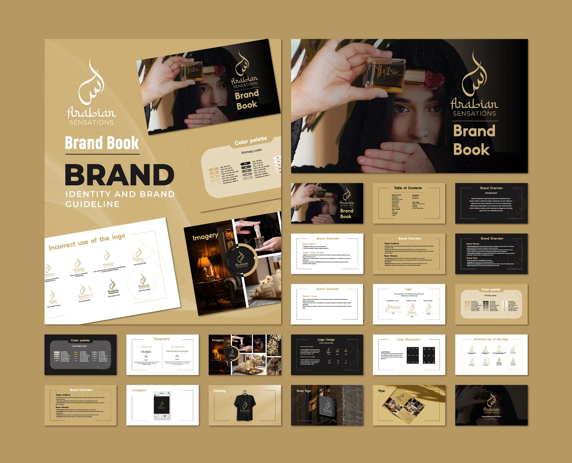
This guide covers how to choose a typeface that fits your brand, how to pair fonts that work together, where free and paid fonts make sense, and the typography mistakes that quietly make a brand look amateur. It's the same approach we apply on graphic design and brand identity projects across 8+ years and 3,000+ projects in 30+ countries as a Top Rated Plus agency on Upwork.
Why typography matters more than people think
Typography is the part of your brand that touches every single thing you make, your website, your ads, your invoices, your packaging, your email signature. A logo appears in a corner; type fills the page. That ubiquity makes it one of the hardest-working brand assets you own, and one of the most overlooked. Most people can't name a font, but they instantly feel the difference between type that looks considered and type that looks thrown together.
It also sets tone before a word is read. The same sentence in a crisp geometric sans feels modern and efficient; in a high-contrast serif it feels established and premium; in a rounded display face it feels friendly and approachable. Choose the wrong voice and you undercut everything else, the way the wrong palette does, no matter how good your logo or full brand identity is. Type isn't decoration around the message; type is part of the message.
A quick test of whether your type is working: screenshot a paragraph of your website body text and read it on your phone in bright light. If you find yourself squinting, zooming, or skimming because it's tiring, your font choice or size is costing you readers, and on a landing page that's costing you customers. Beautiful type that's hard to read is a failed choice.
Start with the brief, not the font
The mistake almost everyone makes is opening a font library and scrolling until something looks cool. That's backwards. Strong type choices come from a short brief you write first, so every font you audition answers to your brand rather than your mood that afternoon.
- Personality — pick three words for how the brand should feel (e.g. modern, trustworthy, warm). Your fonts have to support those words, not fight them.
- Audience — a fintech serving cautious professionals and a youth streetwear label want very different type. Choose for who's reading, not for your taste.
- Where it lives — long articles need a workhorse body font; a brand that's mostly big headlines and packaging can lean on more personality up top.
- Competitors — note what your category uses so you can fit in enough to feel right, then differ enough to be remembered, the same balance you'd strike with brand colours.
Understand the main type styles
You don't need to be a typographer, but knowing the broad families and what they signal makes choosing far faster. Each style carries a rough emotional direction, a starting point, not a rule, just like colour.
| Style | Tends to feel | Good for |
|---|---|---|
| Serif | Established, trustworthy, editorial | Law, finance, publishing, premium brands |
| Sans-serif | Modern, clean, approachable | Tech, startups, apps, most websites |
| Slab serif | Bold, confident, sturdy | Sport, retail, strong headlines |
| Script | Personal, elegant, expressive | Beauty, weddings, artisan brands (sparingly) |
| Display | Distinctive, characterful, loud | Logos and headlines only, never body text |
The practical takeaway: most brands are best served by a clean sans-serif or a readable serif for the bulk of their text, with personality added carefully in the headings. Display and script faces are seasoning, powerful in small doses, exhausting and often illegible if used for paragraphs.
How to pair two fonts that work together
Brand typography usually comes down to a pairing: a heading font with character and a body font built for reading. The art is getting them to contrast clearly without clashing, distinct enough that they feel intentional, harmonious enough that they feel like one system. Here's the approach we use.
- Pick the body font first. This is the workhorse that carries 90% of your words, so legibility wins over personality. Choose a font with clear letterforms, multiple weights, and good rendering at small sizes, then build the heading around it.
- Choose a heading font that contrasts. The easiest reliable pairing is a serif heading with a sans-serif body (or vice versa), the structural difference creates contrast automatically. Pairing two fonts that are only slightly different reads as a mistake, not a choice.
- Limit yourself to two typefaces. One for headings, one for body covers almost every brand. A third should earn its place (say, a numeric or UI font), never just be added for variety. More fonts mean a weaker, busier brand.
- Create hierarchy with weight and size, not more fonts. You can build a rich system, H1 to caption, from a single family using bold, regular, and size steps. Range comes from how you use a font, not how many you own.
- Test them together in real layouts. Drop your pairing into an actual page, a heading, three paragraphs, a button, a caption, before committing. Fonts that look great in isolation can fight once they share a screen.
The safest high-impact pairing for non-designers: a characterful serif for headlines and a neutral, highly legible sans-serif for body text. It gives you instant contrast, reads beautifully at any size, and is hard to get wrong, which is exactly why so many trusted brands use some version of it.
Two fonts from one superfamily
If pairing feels risky, use a single "superfamily", a typeface designed in both serif and sans-serif versions (or with a huge weight range). Because they were drawn to work together, you get contrast and harmony for free, plus one fewer licence to manage. It's a clean, low-risk route to a system that still feels deliberate.
Free vs. paid fonts (and licensing)
You can build a strong brand on free fonts, but you have to choose deliberately and respect the licence. The right answer depends on budget, how distinctive you need to be, and where the type will appear.
| Source | Best for | Watch out for |
|---|---|---|
| Open-source (e.g. Google Fonts) | Most websites and startups on a budget | Popular ones can feel generic, check the licence |
| Premium foundry fonts | Distinctive, ownable brand voice | Per-use licensing for web, app, and print |
| Custom / modified type | Large brands wanting total uniqueness | Cost and time; usually overkill early on |
Whatever you pick, read the licence before you ship. Desktop, web (web-font), app, and embedding licences are often sold separately, and "free for personal use" is not the same as free for a business. Getting this wrong is a legal and rebrand risk, so confirm you're cleared for every place the font will appear, then record it in your guidelines.
Don't skip readability and accessibility
A typeface only works if people can actually read it. The most common failures are setting body text too small, packing lines too tightly, and stretching lines too wide. Aim for body text around 16px or larger on the web, comfortable line height (roughly 1.5×), and a line length of about 50–75 characters so the eye can track from one line to the next without getting lost.
Accessibility overlaps with good taste here. Ensure strong contrast between text and background (the same WCAG thinking that applies to accessible design), avoid all-caps for long passages, and don't rely on ultra-thin weights for important text, they vanish on low-quality screens and in bright light. Type that's easy for everyone to read isn't a compromise on style; it's the point of having type at all.
Common brand typography mistakes
Most type problems aren't about taste, they're about discipline. These are the ones we see most, and each is easy to avoid once you know to look for it:
| Mistake | Why it hurts | Fix |
|---|---|---|
| Too many fonts | Looks busy and unprofessional | One heading font, one body font |
| Fonts that barely differ | Pairing reads as an error | Contrast serif vs. sans, or weights clearly |
| Body text too small or tight | People stop reading | 16px+, ~1.5 line height, 50–75 char lines |
| Display font for paragraphs | Illegible and tiring | Keep display to logos and headlines only |
| Ignoring licensing | Legal and rebrand risk | Confirm web/app/print licences before launch |
| No documented system | Type drifts across channels | Lock fonts, sizes, and weights in guidelines |
The thread through all of these is consistency. Typography only becomes a brand asset when the same fonts, sizes, and weights are used the same way everywhere, long enough that the look starts to feel like you. That's why type belongs in documented guidelines and, for products, in a design system, so the choices survive new designers, new tools, and new channels.
Your brand font checklist
Before you lock your type, run through this:
- Your fonts come from a brief, brand personality, audience, where type lives, not from idle scrolling.
- You have one heading typeface and one body typeface (three fonts at most).
- The pairing contrasts clearly without clashing, and you've tested it in a real layout.
- Your body font is highly legible with several weights and good small-size rendering.
- Body text is comfortable to read: ~16px+, ~1.5 line height, 50–75 characters per line.
- Text meets contrast and accessibility minimums and avoids ultra-thin critical text.
- You've confirmed licences for every place the fonts appear (web, app, print).
- Fonts, sizes, weights, and usage are documented in your brand guidelines.
Choose type deliberately and it becomes one of the most consistent, persuasive parts of your brand, working quietly on every screen and page you publish. If you'd rather have a typeface system chosen, paired, and documented for you, our graphic design and brand identity service builds typography that's distinctive, legible, and ready for every channel, the same care we bring to packaging that has to sell on a shelf. You can see verified results on our Top Rated Plus profile on Upwork.
Frequently asked questions
How many fonts should a brand use?
Two is the sweet spot: one heading typeface with personality and one highly legible body typeface for everything else. A third font should only be added if it has a clear job (such as a dedicated UI or numeric font), never for variety, because more fonts make a brand look busier and weaker. You can build a full hierarchy, from large headings down to captions, out of a single family using different weights and sizes, so range comes from how you use a font, not how many you own.
How do I pair two fonts that work together?
Aim for clear contrast without a clash. The most reliable approach is to pick your body font first for legibility, then choose a heading font that's structurally different, a serif heading with a sans-serif body, or vice versa, so the contrast feels intentional. Avoid pairing two fonts that are only slightly different, because that reads as a mistake. If pairing feels risky, use a single superfamily that ships in both serif and sans versions, since they're designed to work together. Always test the pairing in a real layout before committing.
Are free fonts good enough for a brand?
Yes, plenty of strong brands run entirely on open-source fonts like those on Google Fonts, especially websites and early-stage businesses. The trade-off is that the most popular free fonts can feel generic, so choose deliberately and pair them well to stand out. Whatever you pick, read the licence: desktop, web, app, and embedding rights are often separate, and 'free for personal use' is not the same as free for business use. Premium foundry fonts are worth it when you need a more distinctive, ownable voice.
What font size should website body text be?
Around 16px or larger for body text on the web, paired with a comfortable line height of roughly 1.5 and a line length of about 50–75 characters. Smaller text, tight line spacing, and over-wide lines are the most common readability mistakes and quietly drive people away. Ensure strong contrast between text and background, avoid all-caps for long passages, and don't use ultra-thin weights for important text, since they disappear on lower-quality screens and in bright light. Readable type keeps visitors reading, which is the whole point.
Want this done for you?
FRPROTECH is a Top Rated Plus Upwork agency with 3,000+ projects delivered across 30+ countries. Tell us your goals and we'll handle the rest.
Written by the FRPROTECH design team. 8+ years building brands and websites for clients in 30+ countries, with a 100% Job Success Score on Upwork.